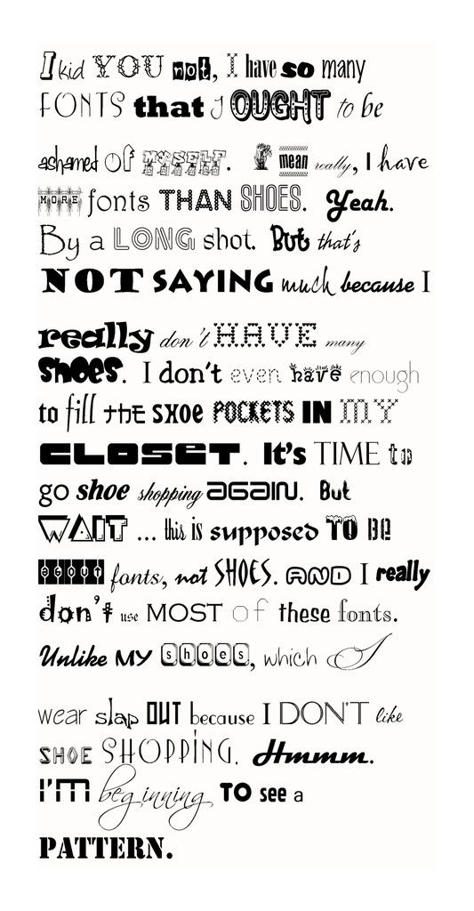
Okay, I am a font freak! Yeah, I know. Pathetic. I love shopping for fonts.
There is something so rewarding in finding the perfect font for the occasion. I’m also highly picky about what fonts should be used where. But don’t let that scare you. That’s just one person’s opinion. ![]()
Here’s a rule of thumb, though, for anyone using fonts. If you’re designing a card, brochure, bulletin or flyer, please keep the font use to a dull roar. One title font that can be as ornate as you want it, provided it fits the occasion. And then one text font for the main body. Use italics or bold if you want.


I about as bad. I download free fonts all the time. One thing I like it for is my digital scrapbooking.
What font did you use for you header?
At work I was called the “font queen”. Now, I think you’d be wearing the crown cuz you have quite the collection there. Yes, I wonder too about the header font? And can I ask for more?
not saying…..”much”
“ashamed”
which ” I ” wear slap
You have some really nice ones! Thanks for the tips too. I’m sure I murder the font rules many times. I just plain get font happy

I like the font on your header as well. I’m sure I could Google “free font downloads”, but do you have a good website for them?
…and I’m wondering just how long it took you to change the font for each word?
Wow, quite a collection! When I see you next, I’ll have to get some hints about where to find them. I’ve worn out all the regular computer fonts.
I like playing around with fonts too, but i don’t think i have quite the collection that you do.:) love your creativity!
LOL that is good! and me would probably be lost to know where to begin using the appropriate font!!
I bet you would have enough to change it for every letter, but that might make it harder to read! I love fonts too. It’s been awhile since I’ve gone on a search for some. Do you download free ones or have you bought a bundle of them somewhere?
I like fonts too, but I feel like a child in a candy store. — It just takes too long to choose! As a teenager I worked at a printing press. We had to set each letter in a caption one by one on special paper using a special light. It took a long time to do just one title. We only had a handful of templates to choose from. Oh my! I love technology!
@madisonsmom2 – It’s PetraScript. Not sure if it’s a free one or not. Various sites sell it.
@clearlyhis – 1. not saying “much” – JoeHand2 I love this one but only have a trial version that doesn’t include all the letters. If you do a search for Dear Joe Font there are at least 5 variations on this one. 2. “ashamed” – Fabulous 50s 3. which “I” wear slap – Beautiful Caps LOVE this one, but it is only caps. I often use them with another scripty font like Flemish Script or even a common text font (see black-eyed susans a few posts back.)
@Yoderfamilyof5 – Some I got on a cd package but I have gotten quite a few from downloads. There are lots of free sites available. Be careful with “free” sites, though. Sometimes they have adware and spyware on them. As long as anti-virus, spyware protection is updated, you should be okay.
@brdeezgrl – I’d really hate to say!!!! Too long, though.
@luvinafrica – see my reply to Yoderfamilyof5
@african_girl_K – trust me … I have too many!
@peacheyboy – don’t let it stop you from using them though … Like I said it’s one person’s opinion!!
@ebersoles – see my reply to Yoderfamilyof5
@ColeenSr – I love technology too. I can’t imagine “typesetting” in that form. I think it’s archaic the way I learned in Dryden, using a monochrome monitor, using a DOS version of WordPerfect to create newsletters. Fighting with the laser printer because I would design something requiring a little too much memory and it would spit it out with this font that I will never choose to use because it reminds me of those printouts.
While I can’t understand a word of the above comment @ColeenSr, I did enjoy the use of your fonts in your post. Mine are so boring so I love some of the ones you used. Favorites…….. “beginning” “enough” “kid” the first “shoes”. Heres an idea… You could ask people which fonts they like and when they reply you could choose one of them for a wonderful canvas ‘creation’ ,you know like for ….um….uh..I don’t know maybe just telling you their favorites….??????? Not that I’m at all disappointed in the fact that I was gone while you were doing that fun little contest and didn’t check my xanga?!?!?!? HEHE!!! And yes I am still going to order the golf pics. Just haven’t been sure about what I am going to do with them right now since our basement(ie Lyns office) is at a standstill right now..
hey thanks for a good laugh! cute!
@sandramiller – “Beginning” is Scriptina. “Enough” is Zelda. “Kid” is Angelina. The first “shoes” is Marquee Moon. I keep meaning to get back with you about the golf pics. I keep hoping to have a chance to get better ones. And I’m sorry you missed the drawing. I may do a drawing in the future, but don’t know when. Maybe I need to get a sponsor, or we could do it raffle style. 🙂